Exporting Data from Primavera P6 and Creating Histograms & S-Curves in Microsoft Excel

Managing complex projects often involves analyzing data visually to make informed decisions. One effective way to do this is by generating reports that include histograms and S-curves to showcase cumulative manpower, man-hours, and costs over time.
In this blog post, we’ll explore the importance of these visualizations and provide step-by-step instructions for exporting data from Primavera P6 and creating these charts in Microsoft Excel.
Why Use Excel in Conjunction with Primavera P6?
While Primavera P6 is a powerful project management tool, Microsoft Excel offers enhanced flexibility and functionality for creating custom reports. Here are a few reasons why Excel is ideal for generating histograms and S-curves:
- Familiarity and Ease of Use: Most users are more familiar with Excel, making it easier to manipulate data and customize reports without extensive training.
- Customization and Flexibility: Excel offers a wide range of chart types and formatting options, allowing users to tailor visualizations to meet specific needs or preferences.
- Data Integration: Excel enables users to integrate data from multiple sources, simplifying the creation of comprehensive reports that incorporate information from other tools or departments.
Step-by-Step Guide: Exporting Data from Primavera P6 to Excel
Step 1: Export Data from Primavera P6
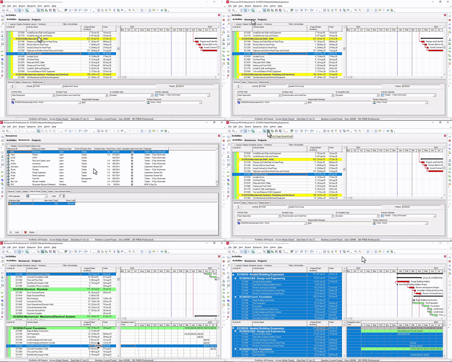
- Open your project schedule in Primavera P6 Professional.
- Ensure the schedule is resource-loaded and/or cost-loaded.
- Navigate to the Activities Tab.
- Open the Activity Usage Spreadsheet.
- Copy budgeted data (costs or units) from the Activity Usage Spreadsheet details form at the bottom.

Step 2: Process Data in Microsoft Excel
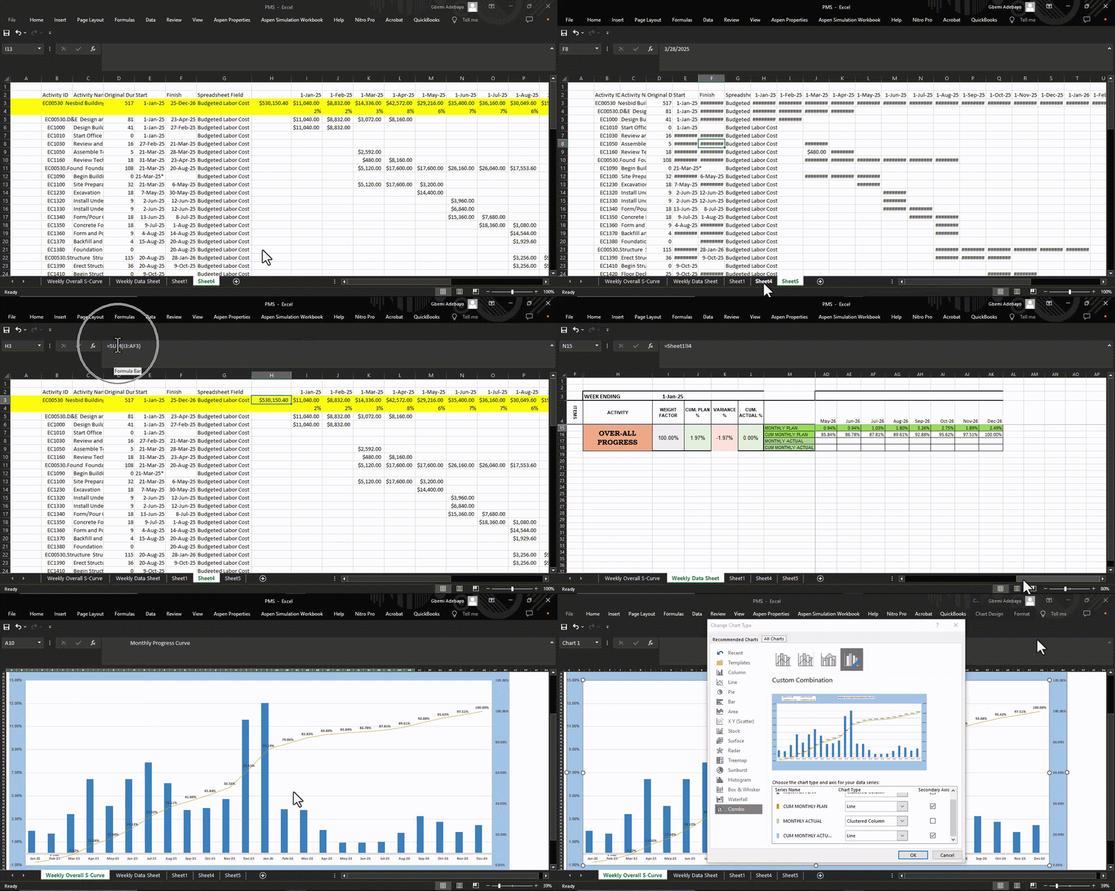
- Paste the copied data into an Excel sheet.
- Calculate the summary of data for each period using Excel’s SUM formula. For example, use
=SUM(I3:AF3)in cell H3. - Calculate percentages for each period. For example, in cell I4, use the formula
I3/$H$3and format the cell as a percentage. - Create a new sheet/tab (e.g., Weekly Data Sheet) and organize columns for plan data, cumulative plan data, actual data, and cumulative actual data.
- Copy the percentage values from the original sheet to the new sheet using formulas, e.g.,
=Sheet1!I4. - Calculate cumulative plan values by summing the previous cumulative value with the current plan value, e.g.,
=N15+O15. - Repeat the steps for actual data to calculate cumulative actual values.
- Insert a Combo Chart with both line and column chart types.
- Move the chart to a new sheet (e.g., Weekly Overall Curve).
- Format the chart with labels, legends, and colors to improve clarity and presentation.

